AZEEZ ADEBAYO
0%
CONTEXT
HSBC operates in 60+ countries. By 2024, its digital estate reflected that scale badly — regional teams had built independently for years, and the brand looked different everywhere it showed up. The brief was to fix that at the source: a new visual foundation precise enough to travel across 40+ markets without losing coherence.
CHALLENGE
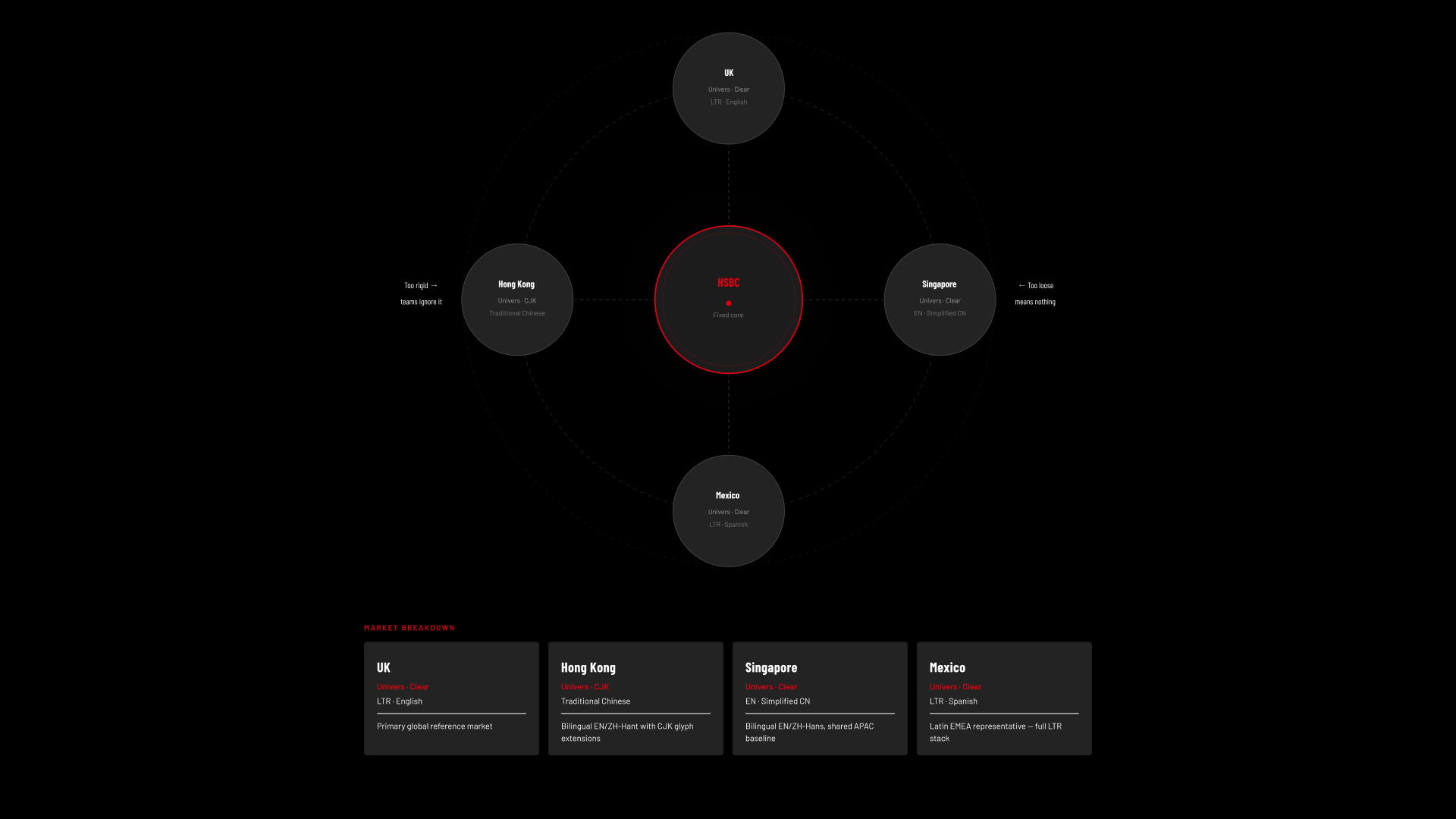
The tension was structural. One visual direction had to read as one company globally and still flex enough that a market variant didn't feel like a compromise. Too rigid, and regional teams would route around it. Too loose, and the North Star would mean nothing.
Six months. Brief to adoption-ready.
Six months. Brief to adoption-ready.
GOAL
Define a new visual identity colour, typography, iconography, photography, and illustration that HSBC could run its entire digital portfolio on. The North Star had to be the following:
* Distinct enough to feel intentional in a crowded financial market
* Clear enough to work across every screen size, language, and market context
* Scalable into a global blueprint that regional teams could adapt without fragmenting the system
* Operationalised into a component library, the Hong Kong team could ship immediately.
* Distinct enough to feel intentional in a crowded financial market
* Clear enough to work across every screen size, language, and market context
* Scalable into a global blueprint that regional teams could adapt without fragmenting the system
* Operationalised into a component library, the Hong Kong team could ship immediately.
APPROACH
We grounded the brief in strategy before touching design. HSBC's brand purpose and five target attributes — modern, premium, clean, bold, and international — became the filter every direction was held against throughout.
(COMPETITIVE AUDIT)
We mapped ten competitors across four markets, examining colour systems, iconography, and screen-level execution. It was a positioning exercise as much as research. What we found: bold and expressive was crowded; clear and functional had a quality gap — legible but dated. The opening was a bank that could be clear and crafted, systematic enough to hold across every script and market without losing sophistication.
Three routes
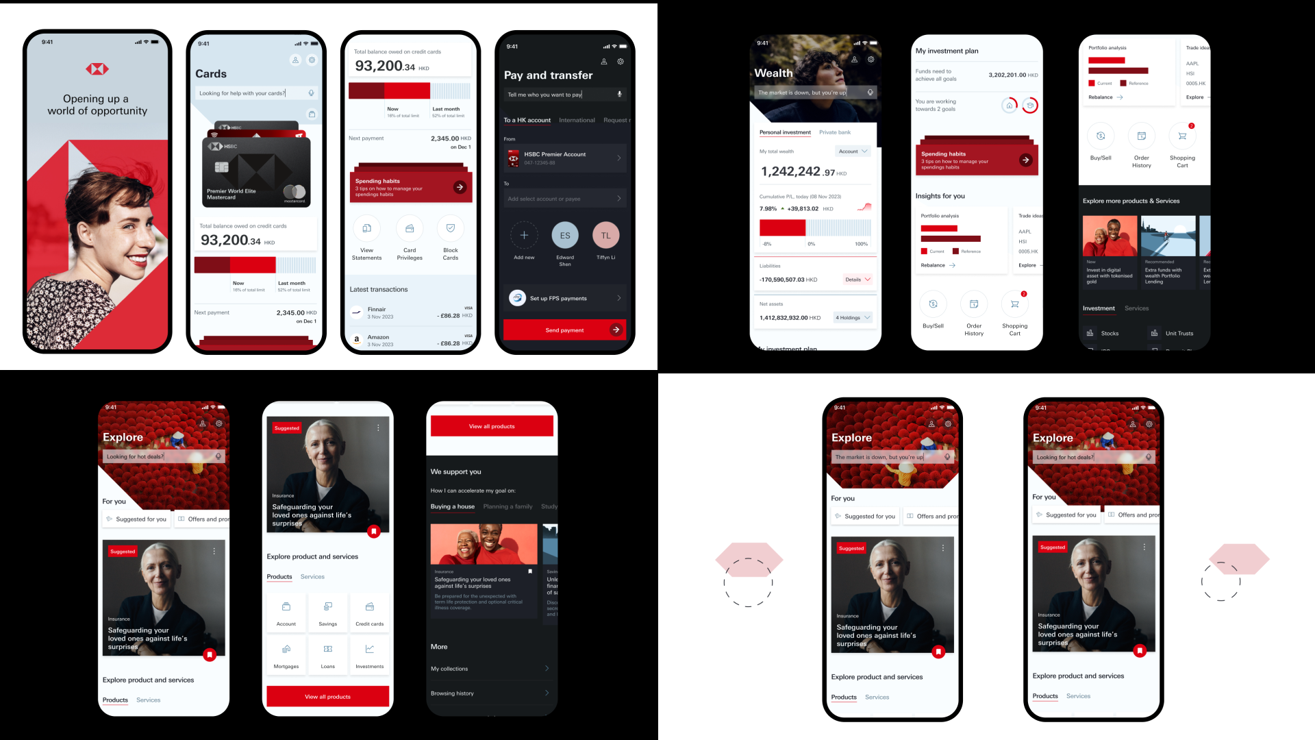
Three genuinely distinct directions, each evaluated against six client-defined criteria — coherence, recognisability, market flexibility, adoption ease, customer connection, and future-proofing.
Concierge — warm, guiding. Pale blue palette, Univers Regular, friendly studio photography.
Exclusive — premium, heritage-led. Dark backgrounds, serif type, engraved illustration.
Brave — bold and entrepreneurial. Full-bleed red, oversized headlines, custom iconography.
Concierge — warm, guiding. Pale blue palette, Univers Regular, friendly studio photography.
Exclusive — premium, heritage-led. Dark backgrounds, serif type, engraved illustration.
Brave — bold and entrepreneurial. Full-bleed red, oversized headlines, custom iconography.
(CONCIERGE WON)
Not because it was the safest, but because it was the most honest about what HSBC needed at scale. It held regulatory content, dense data, RTL and CJK scripts, and 40+ markets without losing warmth.
Where the direction required departures from existing brand standards, we documented the rationale and took each through formal governance. We weren't overriding the brand — we were making a case to evolve it.
Where the direction required departures from existing brand standards, we documented the rationale and took each through formal governance. We weren't overriding the brand — we were making a case to evolve it.
Leading the work
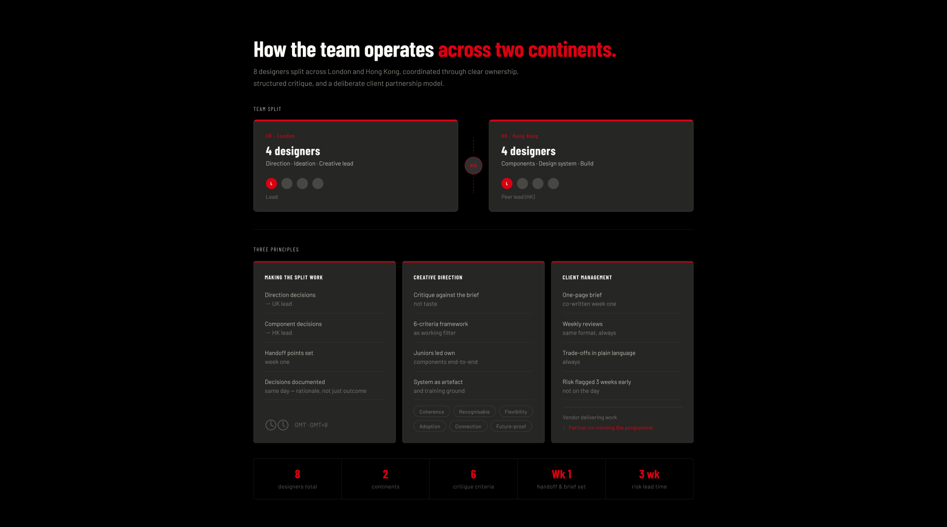
I co-led with a peer in Hong Kong — eight designers across two time zones. Direction and ideation in London; production components in Hong Kong. The split required explicit structure from day one: direction decisions sat with me, component decisions sat with the HK lead. Neither team waited on the other.
The time zone gap meant async communication had to be precise. Every decision was documented the same day — rationale, not just outcome — so Hong Kong could interpret intent without a live call. We treated the gap as a constraint, not an inconvenience.
Internally, critique ran against the six criteria throughout — not just for client presentations. Junior designers owned components end-to-end; I was the first call when something was stuck.
Client-side: one-pager in week one, fixed-format weekly reviews, trade-offs presented as real options, risk flagged early. The relationship shifted from vendor to partner before the halfway mark.
The time zone gap meant async communication had to be precise. Every decision was documented the same day — rationale, not just outcome — so Hong Kong could interpret intent without a live call. We treated the gap as a constraint, not an inconvenience.
Internally, critique ran against the six criteria throughout — not just for client presentations. Junior designers owned components end-to-end; I was the first call when something was stuck.
Client-side: one-pager in week one, fixed-format weekly reviews, trade-offs presented as real options, risk flagged early. The relationship shifted from vendor to partner before the halfway mark.
The global blueprint
Shipping to 40+ markets isn't the same as shipping to one. Blueprint work ran in parallel with identity work from week two — we didn't design the system first and then ask how it would travel.
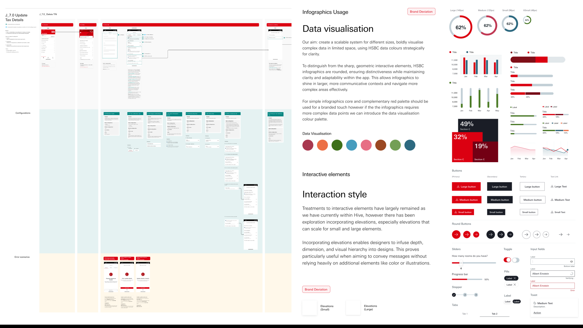
The blueprint defined what was fixed: core tokens, typographic hierarchy, colour system, iconography logic, photography taxonomy, and illustration rules. And what was variable: type options for CJK and RTL scripts, colour adaptations for cultural sensitivities, and layout variants for regulatory requirements.
Seven systems specified in full — photography, typography, colour, illustration, iconography, infographics, and interactive elements — each with enough precision that a market team could implement independently, without us in the room.
The blueprint defined what was fixed: core tokens, typographic hierarchy, colour system, iconography logic, photography taxonomy, and illustration rules. And what was variable: type options for CJK and RTL scripts, colour adaptations for cultural sensitivities, and layout variants for regulatory requirements.
Seven systems specified in full — photography, typography, colour, illustration, iconography, infographics, and interactive elements — each with enough precision that a market team could implement independently, without us in the room.
Outcome
* Delivered within the six-month timeline
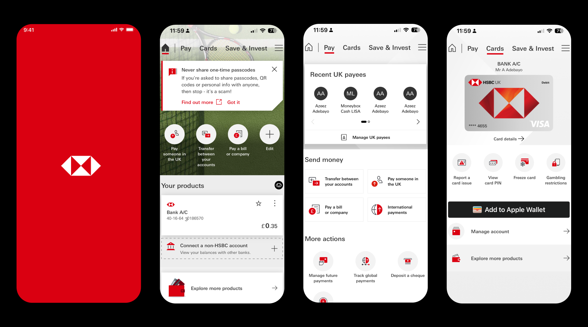
* 130 UI components built and handed to production by the Hong Kong team
* Blueprint adopted across 40+ global markets
* Seven complete visual systems documented for independent adoption
* First unified visual language in HSBC's digital history
A market team in Mexico and one in Hong Kong could both ship from the same system and produce work that felt native to their context. That's what the North Star was actually for.
* 130 UI components built and handed to production by the Hong Kong team
* Blueprint adopted across 40+ global markets
* Seven complete visual systems documented for independent adoption
* First unified visual language in HSBC's digital history
A market team in Mexico and one in Hong Kong could both ship from the same system and produce work that felt native to their context. That's what the North Star was actually for.
LET'S TALK
LONDON, UNITED KINGDOM